It’s usually the first part of the dining out experience. Well, most likely the review from a newspaper or magazine critic, or perhaps the recommendation from a trusted friend might be the absolute first step (please, please don’t say browsing Yelp).
When it’s crunch time though to start planning where to dine tomorrow night, where to go on that important second date next Thursday, or you’re just hungry and bored at the office dreaming of that Spain vacation down the road, you google for a restaurant’s website.
The restaurant website is critical for restaurants today. It’s no lie that the first impression of a restaurant is the website. The chef might be a genius. The atmosphere can be magical. But that website has the most annoying music possible with too many quotes praising the chef. O.k., skip it, on to the next one.
Unfortunately, an excellent chef or an excellent restaurateur doesn’t always translate into an excellent web site designer. There are two fundamental problems with restaurant websites that draw the ire of frequent visitors (yours truly certainly included): annoying graphics/ site design (definitely including music and video) and lack of information (don’t you love outdated menus or searching for hours of operation for…hours?).
Generally I can look past a poor website if I’ve heard excellent reports from a restaurant. I’ll still give the restaurant a chance. Let’s be honest though, the restaurant website is very important from an impression standpoint and a decision making one as well. I’m happy to report that the art of the dining scene worldwide is in far better health these days than the art of the restaurant website. With how vital the website is now to the dining out process and the endless resources today in 2013 web design (don’t we all wish we graduated from college with a CS degree?), let’s hope that more restaurants see the (silver) light.I’ll use 15 or so examples here of restaurants I’ve visited lately (not necessarily in person, but certainly online) and split them into three categories: Ideal Websites, Good and Bad Websites, and Websites In Need of Help.
What makes an ideal website?
It doesn’t take a lot. Visually, it’s captivating. Maybe there are exciting graphics, video, and music, but none of them distract you, or crash your computer. The hours and location are obvious. It’s easy to find contact information by phone, email, and whatever social media. The menu is updated daily and includes current (!) prices. Perhaps there is a useful “about” page with biographies and descriptions. The press clippings page is up to date and not dominating everywhere (a restaurant website is very different than a film’s or a play’s website).
In simple terms, consider the website a virtual extension of the food, the people, and the ambiance of the restaurant’s experience. If it accomplishes that and doesn’t drive you (or your cubicle mates) crazy, then I’ll possibly be dining there soon.
 Ideal Websites
I’m not surprised such a diligent restaurant has an easy to navigate, aesthetically crisp and clean site, very much like the dining room itself. It’s even easy to navigate over to the other related restaurant’s websites say if you want the avec menu or Big Star’s hours.
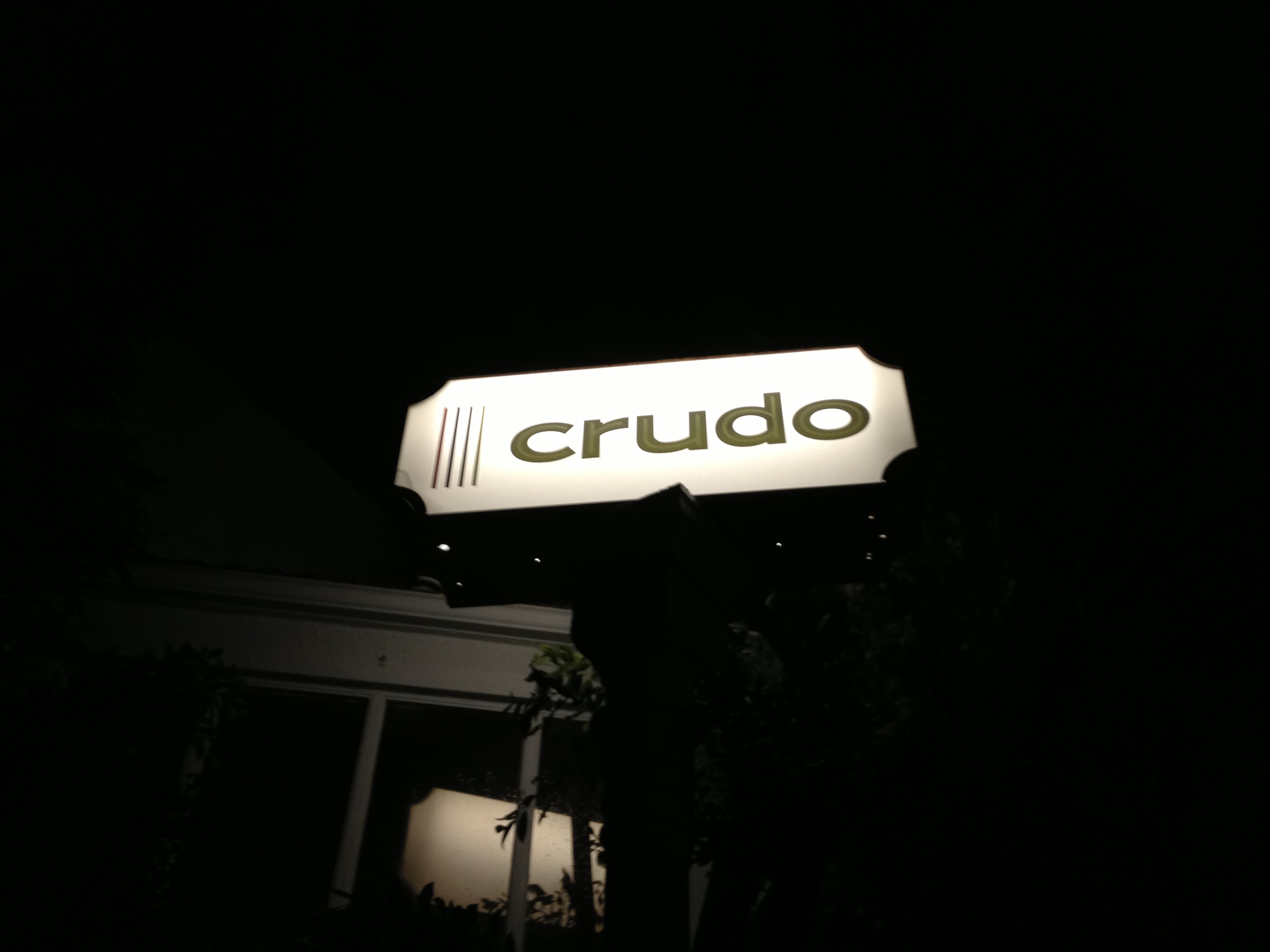
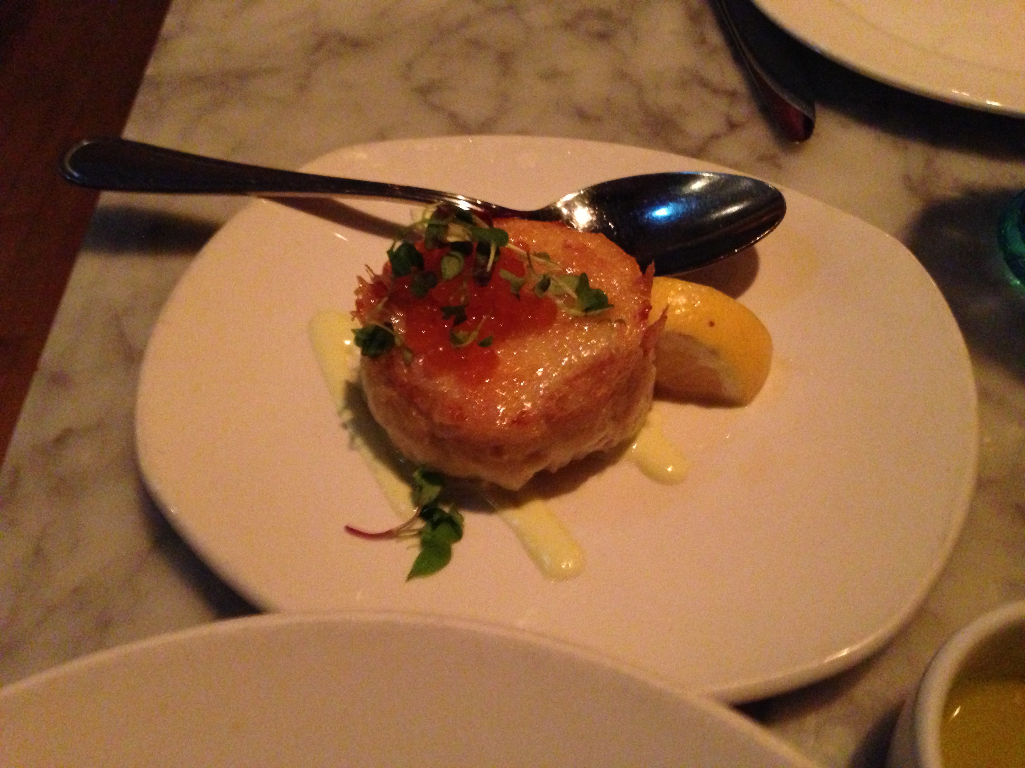
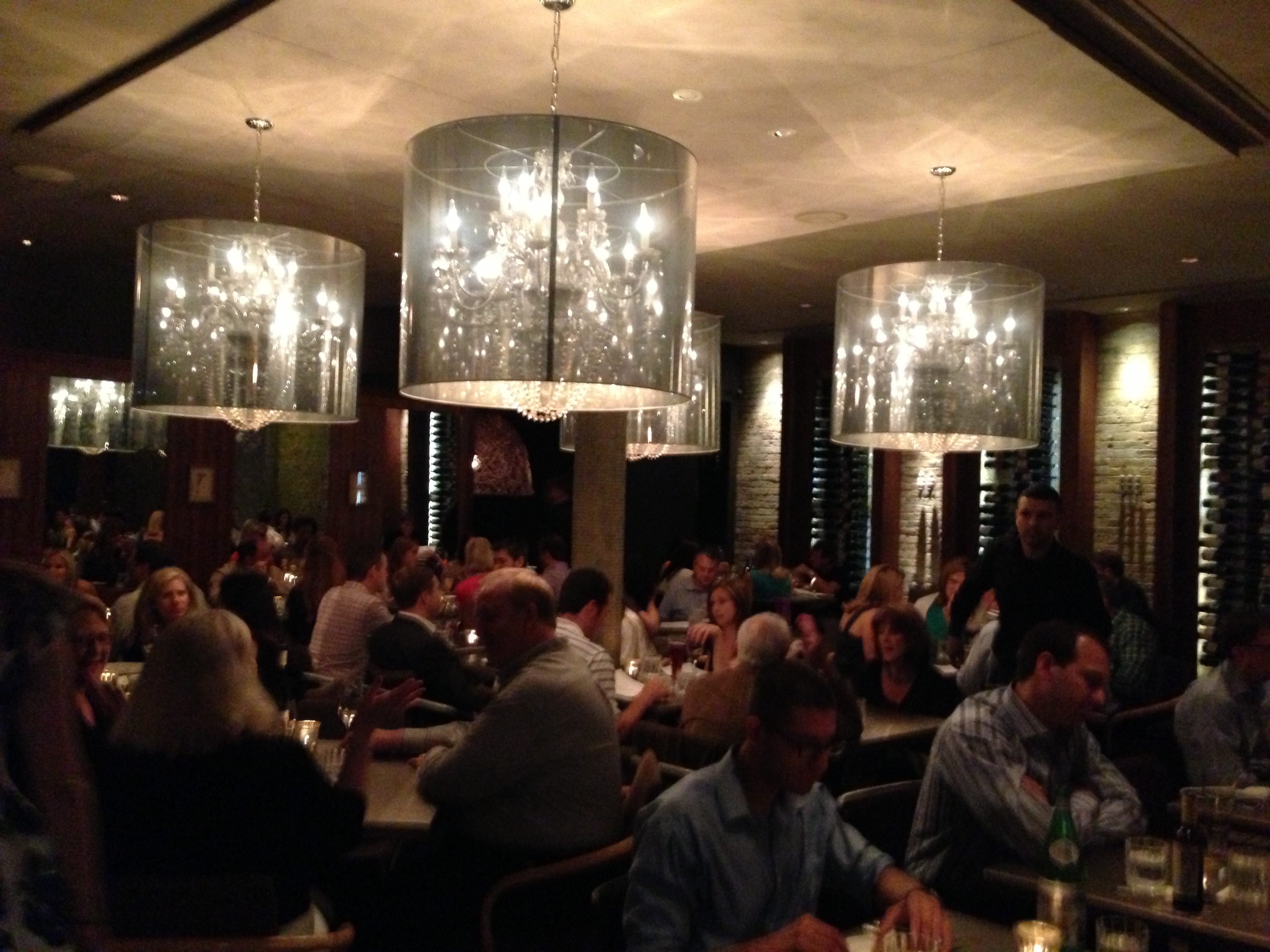
Like Blackbird, another example of a crisp, concise restaurant with nothing flashy, yet where everything is fantastic. Including the website. Bonus points to Crudo for listing signature dishes you will always find, while the seasons influence the rest of the menu.
Charlie Hallowell’s Temescal District institution pioneered both the neighborhood it’s in and the concept of a daily changing menu being posted online just before service. It’s one thing to have a seasonal menu on the website with a few changing specials. It’s another thing to be like Pizzaiolo where THE menu is on the website for tonight. I know many people (myself included) who have seen the squid pizza appear on the menu in the afternoon and you see us at the restaurant two hours later. Just like the restaurant, nothing splashy here. It’s just honest and precise. Every corner is covered.
The Fat Duck, Berkshire, England
A big round of applause to Heston Blumenthal for what I would consider a flawless, creative website. You get the chef’s playful sense without a sensory overload. Yes, that’s surprising knowing that Blumenthal is a chef who even plays music with dishes in the actual dining room. The website shows class with an edge.
It’s almost like John Rivera Sedlar is making fun of the other websites around where you have the option on the homepage to click on “the hallucination.” You’ll have no problem finding menus or hours, or even the information that you can call a phone number to receive descriptions of specific dishes. For those of us lucky enough to have been to the restaurant, the website is a natural extension from Flower Street.
Good to Bad Websites
Momofuku Ko and Ssam Bar, New York
Like the Momofuku restaurant themselves, the website is very to the point, a touch brusque, with a touch of whimsy. What’s Momofuku? Look on the bottom line. Questions about Ko’s complex reservation system or Ssam’s lack of reservations? I guarantee your question is answered. It’s easy to navigate from the Ramen Bar to Booker & Dax to Ko. Hours? Check. Location? Yup. Menu? It’s there, updated daily…but where are the prices? We need the prices! Looking at the website, you just don’t get the sense of fun that is dining at a David Chang restaurant.

Recently I enjoyed a wonderful dinner at this young Barcelona stalwart from brother and sister Jordi and Amèlia Artal. It’s still a mystery how Jordi can cook with such skill and artistry, AND be a self-taught cook. Every dish has several nuances, but makes sure to stay one step behind the full frontal molecular gastronomy displayed by many of his local peers. Everything on the website is crystal clear, especially the policies. Yet I’m still wanting more from the vague menu descriptions. So you’ll get some “fish” or “meat” in your prix fixe meal. The “Essència” menu doesn’t help itself either by being described as “simple, less elaborate courses.” Who wants that? Luckily once at the restaurant, the menu is much clearer.
I can’t get over the “mouse over the color block and then you’ll find out where to press” idea. It feels almost Chuck E. Cheese- esque. All the information is there frotunately. You’ll have to dig for prices (it’s in dining info), the menu is a worthless list of ingredients, and under “team” is just the chef. A one man team. But, I can’t complain that the website is missing information. It’s just not an enjoyable or well organized website.
Uchiko and Uchi, Austin, TX Tyson Cole’s wonderful Austin, Texas duo boasts the same tranquil, yet cosmopolitan flair both restaurants have. My lone problem is navigating the crammed menus…what is updated today? What isn’t here today? What’s a special and what isn’t a special? I can figure it out after some thinking. Yet, nobody wants to really think that much when reading menus. And where are the prices of the regular menu items?
 The Catbird Seat, Nashville, TN, and Alinea, Chicago
We’ll call this the ambiguous restaurant category. You don’t know what the menu will be until you show up, so that’s a legitimate excuse for their lack of content. The Catbird Seat is great at telling you up front the menu will not be online. The FAQ is very helpful, but not everyone will want to slowly go question by question to learn about a restaurant. It’s a bit strange for a restaurant with such a strong personality to seem so cold online. Alinea has never won any awards for its home page design. Are those bubbles evoking the sea? The logo looks a coffee mug, huh? All the info is there for you when you work at it, including the not actually complex reservation “tickets.” As a bonus, there is even a menu, even if it won’t be the same when you dine there. It’s just not a particularly pleasant website if I may say.
Websites In Need of Help
I did a double-take the first time I saw the website heading. Yes, it does indeed say “a favorite among restaurants.” /what restaurants? Who says that? Is that even correct grammar? I haven’t given Searsucker much praise in the past for its cuisine or rock concert volume atmosphere. Nor will I praise the website. Literally, you can’t escape the relentless quotes of praise for “celebrity chef” Brian Malarkey. It even says “celebrity chef” right there for you on the front page. “Best restaurant” this and “honest food” that tags are everywhere and so are “Top Chef” mentions. Don’t get me started on the mathematical + menu + format.

Coqueta, San Francisco and The Yeatman, Porto, Portugal
Chef Chiarello, where’s the menu? We can read Michael Bauer’s review and load employment applications, but we don’t know what we’ll eat or experience whatsoever at Coqueta. When you actually see the menu at the restaurant or on other sites, it’s spectacular. Don’t hide it! Recently I had a wonderful “blind” dinner at The Yeatman, a stunning restaurant overlooking the Douro River in Porto. When I say a “blind” dinner, I mean to ask for you try to find the menu, prices, and really any information about the experience on their website outside of some express weekday lunch menu. Well, there’s a brief chef bio and a nice emphasis on the wine cellar being Porto after all. Such a great restaurant and hotel can do far better.
Morimoto, Napa and Sepia, Chicago
I might have to give Morimoto’s the award for most painful opening introduction. The “M” just never ends…then the heart beats. The “M” keeps going and going, just look. Wait, you’re supposed to press the heartbeat? You finally figure that out after a minute long trance. Once inside, you’re looking at gnarly tree branches and inspirational quotes. Everything else about the webpage is fine, if you can stick around long enough to peruse the menus in various cake filling colors.
Then there are the websites that open with full length films that crash your computer or ambiance music that embarrasses you in front of co-workers when it starts playing before you can hit pause. Often the opening video or image montage doesn’t relate to the restaurant at all, such as Sepia’s. I’ve recently been looking at Sepia’s page only to be reminded of one of my all time least favorite pages, The Edison in Los Angeles. I love vintage Hollywood and old Paris cabarets as much as anyone. But…every…time you have to open the web page, watch the dancers, and listen to the music…no wonder I remember the Edison’s webpage and I haven’t even been to the bar for three years. The butterfly dancer never goes away. Never! The same with that song on Sepia’s page. I’d probably like it more after one of Sepia’s cocktails.
Tito’s Tacos and Father’s Office, Los Angeles
For Tito’s, all I can say put your computer on “mute,” NOW! The jingle is a Los Angeles legend for all the wrong reasons. For that matter, so is Tito’s. The Father’s Office site is exactly like how the restaurant operates: the burger and beer selection is top notch, but every other detail is intentionally ignored. While the bar staff at both Father’s Office locations are incredibly helpful, the bus staff consistently acts like they’d rather be anywhere else in the world, and they’ll gladly let you know that if you ask for napkins and a fork. On the website, forget about menus. At least you eventually find the hours. And hey, you can buy a skateboard and t-shirts. Like the Tito’s jingle, the sound effect of the blinds closing to evoke an office will make you throw the water cooler out the window of your office.

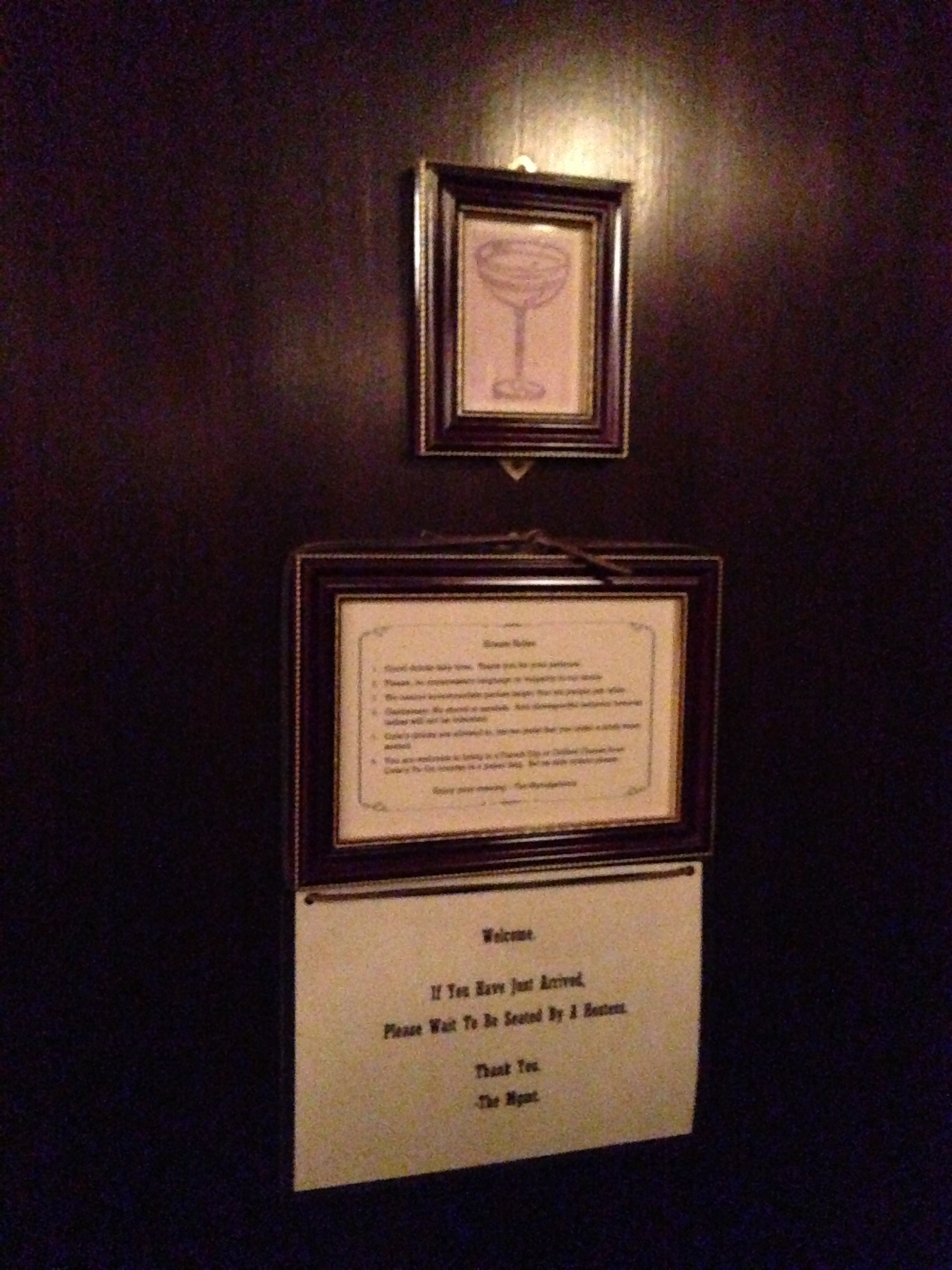
PDT, New York
The Varnish in Los Angeles used to have the website winner with literally nothing except a cocktail glass sketch. Not even a phone number. They’ve since mildly upgraded (thanks to the corporate folks at 213 Nightlife). For the website that gives you essentially nothing but a picture, we’ll include New York’s PDT. Yes, The Varnish and PDT are “speakeasies.” But, they’re not exactly secrets. Let’s see a menu and some hours please to go with the handsome deer bust. Or prices. Or something. I promise I won’t tell.
